
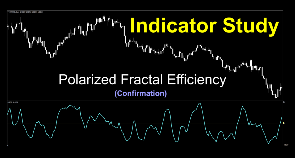
Polarized Fractal Efficiency
If you’d like to follow along with the e-book version of the blog, click on the play button in the audio player below (at the bottom of the page).
Fractally Delicious
Fractal geometry, Mandelbrot and chaos theory comprise an area of mathematical fascination. There are a few indicators which rely on fractals, including the Fibonacci sequence in its various forms (which we don’t use); however, they can be difficult to use and often contain a degree of subjectivity which may whipsaw your account into oblivion.
Stepping Carefully
We did profile an indicator which touched on chaos theory a few weeks ago called the “Random Walk Index” indicator, which suggested that price may or may not follow any predictable course. In any event, we’re going to look at something a bit out in left field. When I suggested it to VP, he wasn’t sure about it, but after some investigation and discussion, we decided to press forward with it.
George of the Jungle
Remember him. The guy who swung from tree to tree, until he didn’t? This indicator draws on the concepts of fractal geometry and Mandelbrot to describe how pricing moves between two points over time. Just like George, the more linear and efficient price movement traverses from one price point to the next price point, the shorter it travels. This is, my friends, the description of slope; i.e. the trend. As this is a zero cross confirmation indicator, the amplitude of the signal line in relation to “0” matters. We’ll get more into that later.
Mandelbrot With a Side of Geometry
It’s an odd word; “Mandelbrot”. What exactly is a Mandelbrot and what does it have to do with geometry. And furthermore, what does it have to do with us? The original concept came to light in the early 1900s when two French mathematicians fleshed out the original idea in their complex dynamics work. However, it wasn’t until the 1970s when The Mandelbrot set concept was first defined and draw and finally visualized in 1980 and became an indicator for the rest of MT4 users in 2008. Its name came from Benoît Mandelbrot, a Polish-French-American mathematician in 1975 and its formula is;
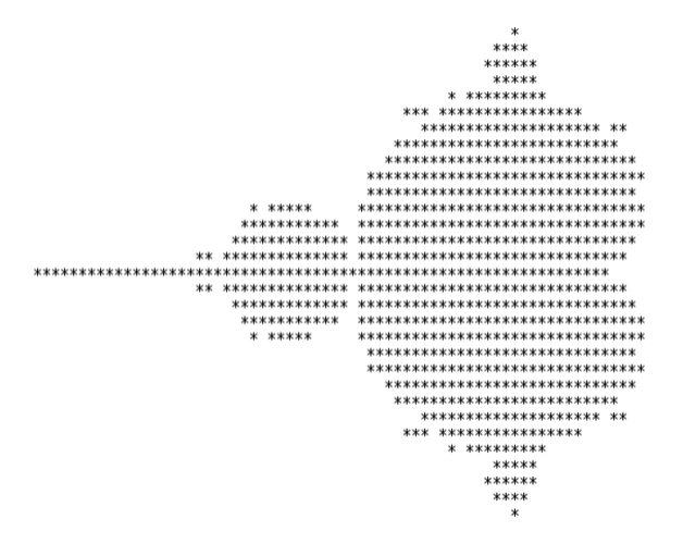
The very first one looked like this…recognize it?
Eye Of The Beholder
Before we get into fractals, let’s sidestep into something where math has a direct effect on what we see…kind of like an indicator, right? The image calculated from the formula creates an extremely detailed graphic representation you may recognize with more modern representations. As magnification increases towards infinity, the “fractal curve” is created. Say what? Me too. Let me put up an image. It makes more sense.
Mandelbrot (Horsefish Tail)

Holy crap. So that’s what it looks like? Yeah, I figured you’d recognize it. It shows up all over the place in nature.

So it only goes to suggest that it shows up on your chart by way of an indicator to price movement reaction. Think about it. If we show you a chart and don’t indicate the time frame, there would be no way of knowing if it was a 5-minute, 1-hour, or daily. However, indicators will pretty much act the same across all of them because each is a fractal of the one above it; i.e. just a smaller version.
Recorded History
Before we get into the chart work and all the mystery surrounding it, settle back for the video. We made some minor visual adjustments, doubled the value of the variables for better signal identification, and decided to shoot the 1-minut USD/JPY to change things up a bit for this week. Settle back and take it in.
Minor Visual Modifications
We used the default settings and just brightened up the signal and zero lines, but that’s it. We change the candle colors to a paler shade of white to keep you focused on the prize.
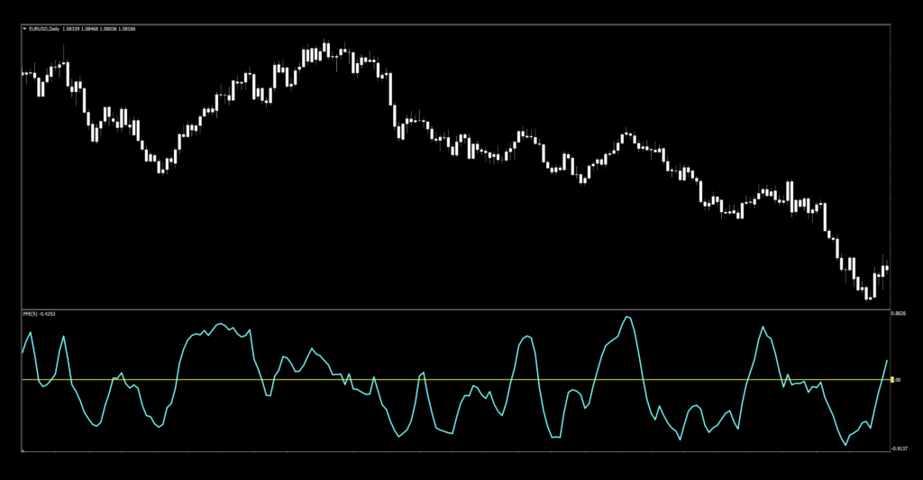
Amplitude and the Zero Line
Earlier, we alluded to amplitude with respect to where the signal line crosses. In one description, the “trendiness” of price is indicated by its departure from the zero line. At the extremes it means that the market is in a trend and the closer it is to zero, the market is decidedly range bound. We marked up a portion of the chart to better illustrate what we’re talking about. However, there is a solid “rule” for the signals…which you all know and we’ll reiterate.
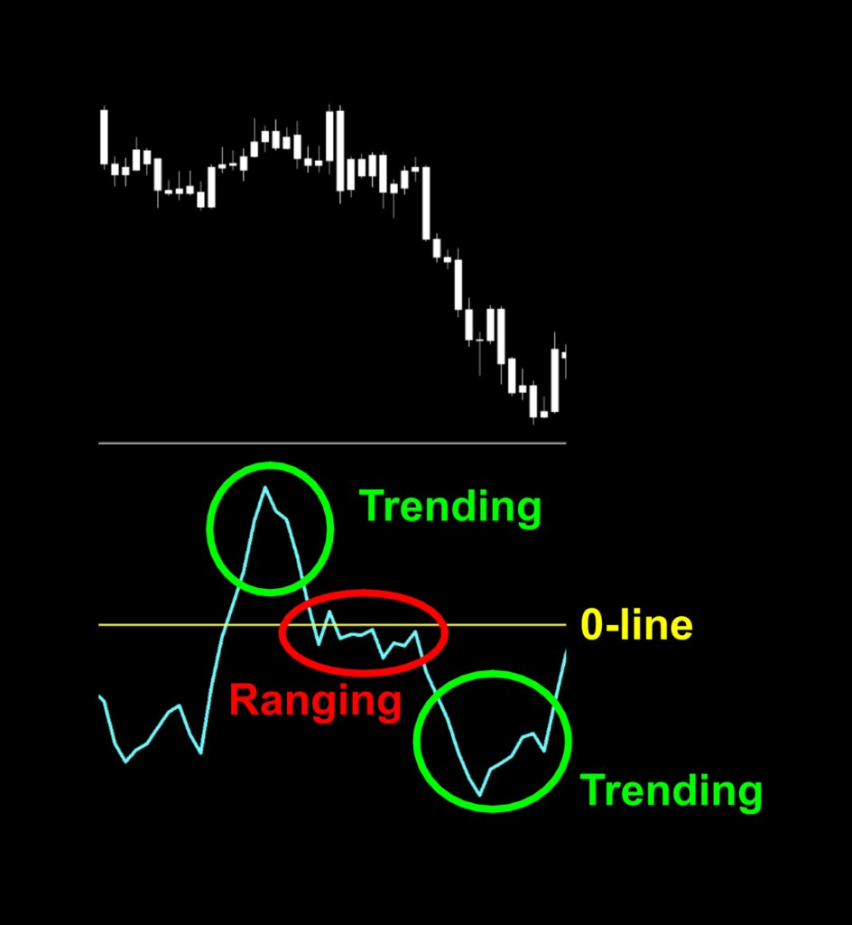
Subjective Signals Suck
We don’t do “subjective”. And by that we mean, deciding what constitutes an acceptable degree of amplitude deviation (how high or low) from the zero line might start a war with your account. So what do we do? All together now. We use the zero line. Period. End of discussion.
Settings
There are three settings for this indicator and we’ll be using all of them.
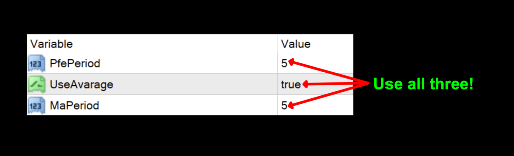
PfePeriod: This is the number of periods used in the fractal formula. The default value is 5.
Use Avarage: We’re assuming this is a spelling mistake and should be “UseAverage”. Doesn’t matter. This value averages the other values. It can be toggled true/false. The default value is true.
MaPeriod: The smoothing value applied to the PfePeriod. The default value is 5.
Advantages
* A different kind of math.
* Enough variables to provide testing latitude.
* Signals are definitive because subjective opinions don’t matter.
How we use it.
One of three actions need to happen in the last 30 minutes prior to the close of the trading day. They are; opening, maintaining, or closing a position. This is when you make your trading decisions, and not actually wait for the close at 1700 EST, because we trade on the daily time frame.
Long signal: When the signal line crosses above the zero line. Do not try to anticipate if it will go higher or cross below. Entry is in the last 30 minutes of the trading day.
Short signal: When the signal line crosses below the zero line. Just trade what you see. Don’t start changing the rules. Entry is in the last 30 minutes of the trading day.
We’ve Got Some Traffic
Upon initial inspection, we had some congestion. This is not new to us, and it appears with other indicators. Don’t forget, this is just on the default values. We looked at tweaked settings and were actually quite pleased.
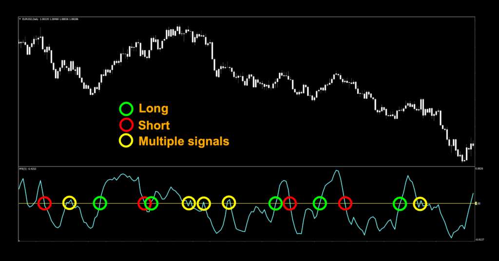
Okay then, let’s break this down for Bobby in Iowa…and everybody else who wants in on this action. Green and red circles depict clear long and short signals respectfully. Where it gets a bit fuzzy are the yellow circles near the zero line. This happens to coincide with ranging market conditions. That means, the indicator is doing its job. You might ask yourself if you should wait until the line departs from the zero line a bit. A bit? How much is a bit? That would be a big no. You have an algorithm which is designed to keep you out of trades that should not happen, and the signal is the signal. Rules, man. Learn them, love them, live them.
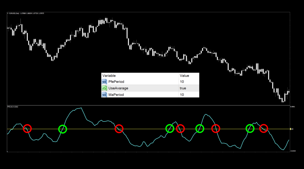
Just For Grins
Just to show you how easy it is (again) to tweak for better signals, we just doubled the first and third settings, just like we did in the video analysis. It took about 4 seconds. There is no excuse for not putting the work in. I can see the potential winners and losers with just a cursory glance. You can too.
Testing For Bob and Doug McKenzie
If you’re new to these studies, we recommend looking at some of the older blogs to understand how we conduct our testing and which markets we test.
Results To Eyeball
Below is the data from our testing.
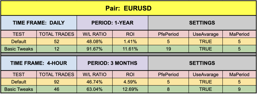
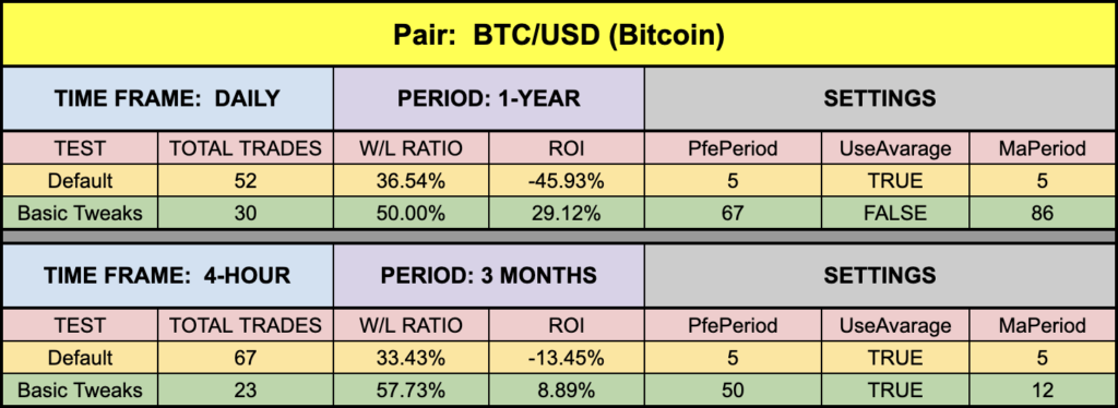
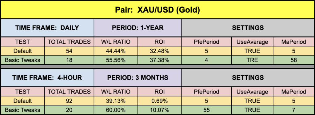
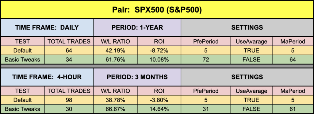
Not too bad across the board. We were actually above the waterline on the daily and 4-hour EUR default settings, but the daily XAU just killed it this week. I mean, who doesn’t appreciate those default values? Naturally, BTC came from way behind and performed quite nicely. Overall, this has some legs and should definitely be considered for testing on your own.
Resources
We’ve made this indicator available for download on our site from the indicator library, for free! When you’re ready to get it, click HERE. For the advanced course, click HERE.
Our only goal is to make you a better trader.
BTW – Any information communicated by Stonehill Forex Limited is solely for educational purposes. The information contained within the courses and on the website neither constitutes investment advice nor a general recommendation on investments. It is not intended to be and should not be interpreted as investment advice or a general recommendation on investment. Any person who places trades, orders or makes other types of trades and investments etc. is responsible for their own investment decisions and does so at their own risk. It is recommended that any person taking investment decisions consults with an independent financial advisor. Stonehill Forex Limited training courses and blogs are for educational purposes only, not a financial advisory service, and does not give financial advice or make general recommendations on investment.