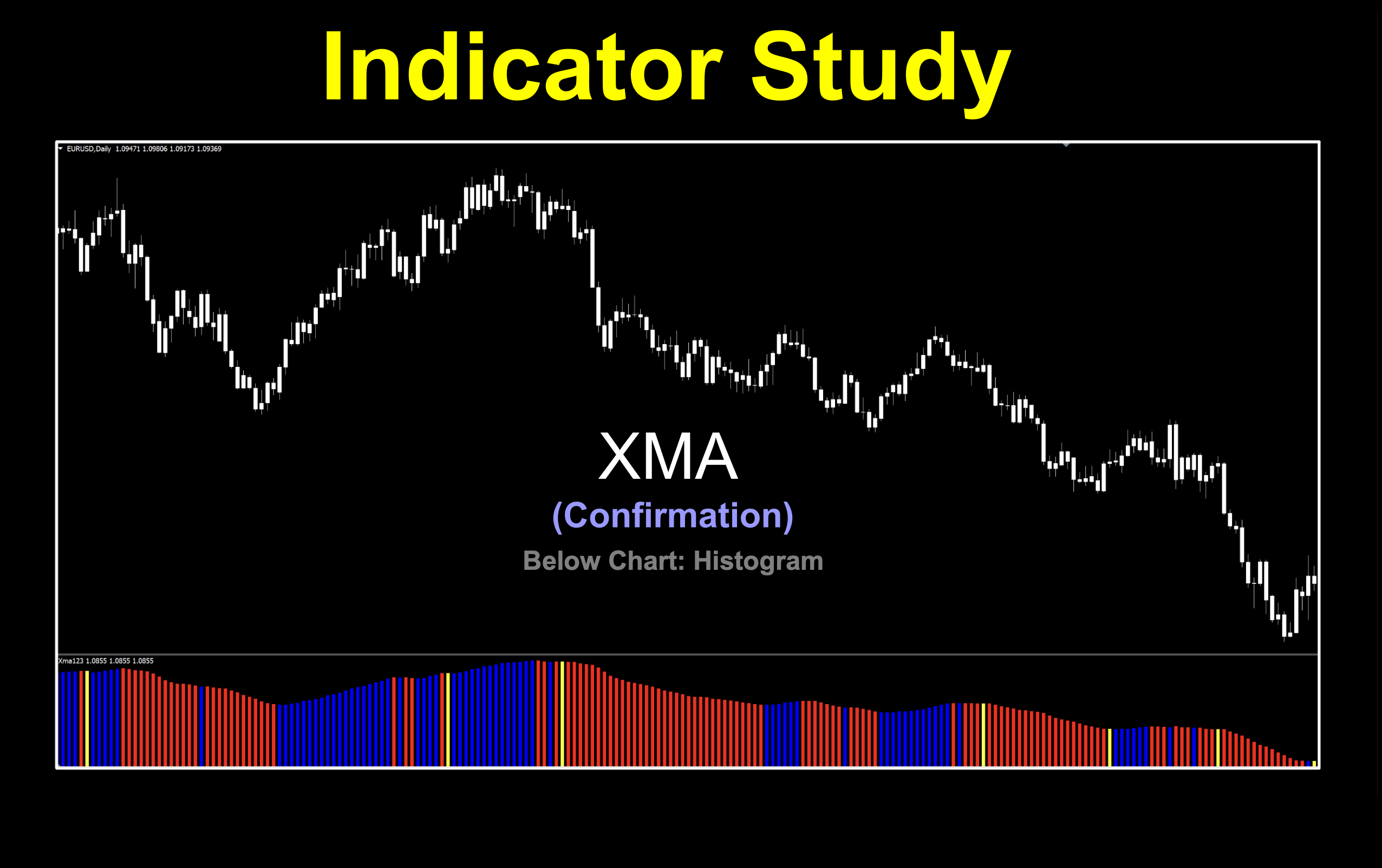
XMA
“X” Doesn’t Always Mark The Spot
We happen to stumble across an indicator which seems really awesome visually, but then we started looking a little closer and noticed something rather odd. The signals were somehow “off”. But, we didn’t let that stop us. Let’s jump into this week’s mysterious sounding indicator and find out what the dealio is.
Po-ta-to, Po-tah-to
We’re looking at an indicator called XMA, which of course is a moving average of sorts. There are a few versions out there, some single colored, some multicolored and with varying menu settings. We settled on a colored version which materialized into existence in 2008; however, when we started testing it, we noted some oddities which we addressed.
Layer Cake
The way this moving average conducts business is a multi-layered affair. It uses the moving average of a moving average; i.e., DEMA (Double Exponential Moving Average) then adds another filter whereby the DEMA is compared to the EMA. If that result is within a specified value, it’s considered a “no trade” and happens more often during ranging periods, otherwise it’s either long or short. What’s cool about our version is that we don’t only have exponential moving averages, so the playing field just got a lot bigger.
Details Matter
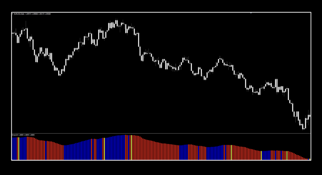
Before we start digging into the mud, we’ll tell you right now that once we saw the issues with the colored line, we went right to our in-house coding expert, Niels. He had the magnificent idea of turning it into a histogram, which as you all know is easy on the eyes with respect to signals and more importantly, fixed the problem we’ll discuss shortly. That being the case, we’ll momentarily adjourn here for the video. But be sure to come back for all the dirt there is to dish, settings, signals, and of course testing results.
Just the Facts
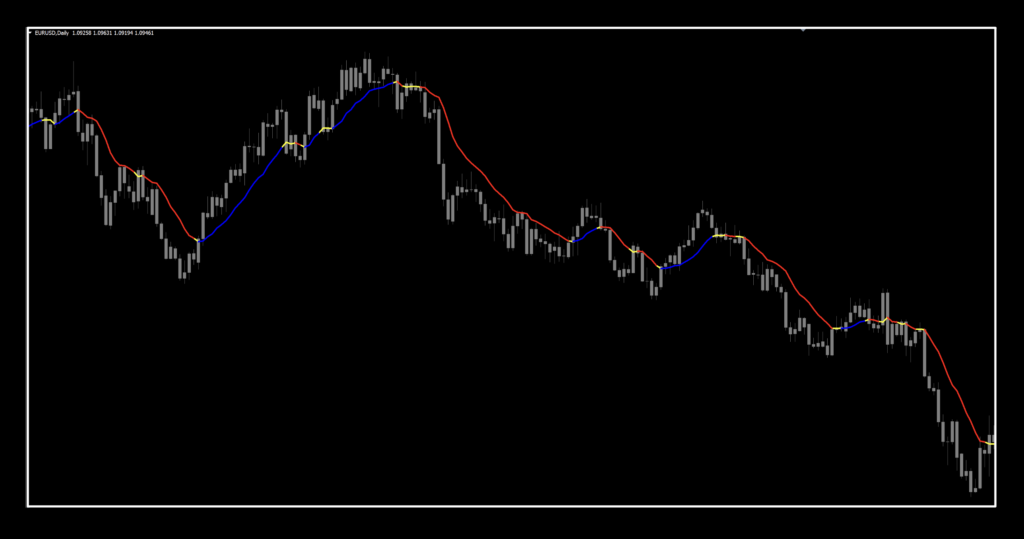
We’re going to show you the indicator in its original form, with brightened up colors. We turned our candles to a dim gray because it makes it easier to see the indicator in its raw form.
What IS the Dealio?
The dealio is that those signals don’t actually line up with the color changes. Check out the image below. Trades are opened up in places other than where you think they should be. However, the trades are not wrong because the indicator is looking to the data, but the visual signals were not aligning with data, so in essence, you’d be entering trades in the wrong period.
Use This One
So, as I mentioned, Niels worked some of his magic and “poof”, we now have a version that is visually accurate and looks like this.
Now that we’ve got the who, what, where and why out of the way, let’s cover the settings.
Settings
There are five variables, and you’ll be pleased to know that all of them have a place. That also means this indicator can be tweaked in quite a few different ways. Don’t mind the spelling of the settings, they do what we need them to do.
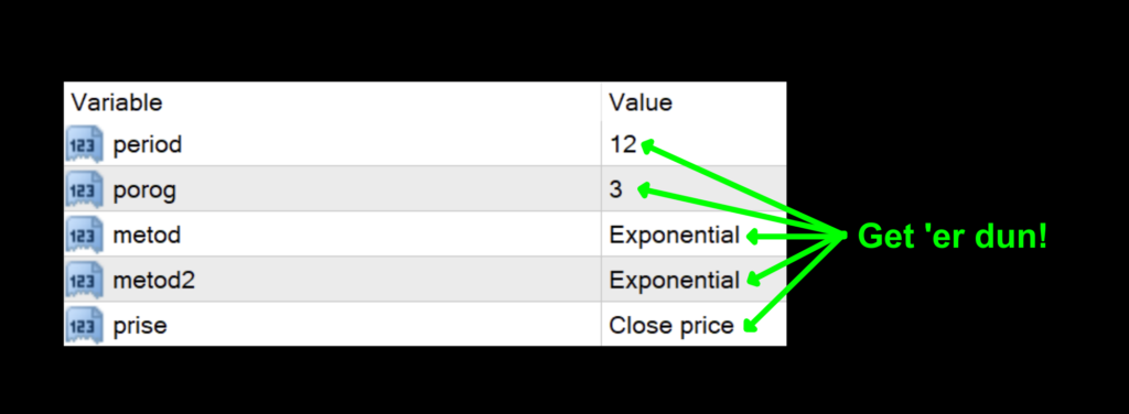
period: The number of periods for the overall calculations. The default value is 12.
porog: The threshold of filter’s sensitivity. The default value is 3.
metod: The type of moving average used for the first moving average value. 0=Simple, 1=Exponential, 2=Smoothed, and 3=Linear Weighted. The default value is Exponential.
metod2: The type of moving average used for the second moving average value. 0=Simple, 1=Exponential, 2=Smoothed, and 3=Linear Weighted. The default value is Exponential.
prise: This is the price data set. 0=Close, 1=Open, 2=High, 3=Low, 4=Median, 5=Typical, and 6=Weighted. The default value is Close.
Advantages
* Creates a “smooth” signal line.
* Histogram provides better visibility of trade signals.
* Splendid flexibility with regard to settings.
How we use it.
One of three actions need to happen in the last 30 minutes prior to the close of the trading day. They are; opening, maintaining, or closing, a position. This is when you make your trading decisions, and not actually wait for the close at 1700 EST, because we trade on the daily time frame.
Long: When the histogram bar turned blue. Entry is in the last 30 minutes of the trading day.
Short: When the histogram bar turns red. Entry is in the last 30 minutes of the trading day.
No Trade: When the histogram bar is yellow. Sit on your hands and wait for a signal.
Bars Worth Visiting
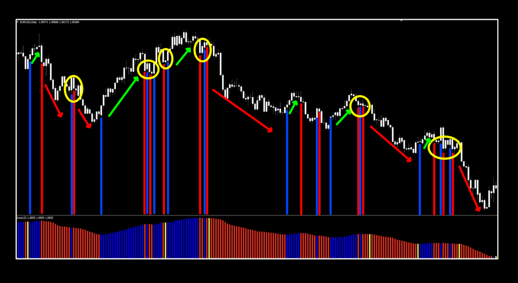
Busy Bar
At first glance, there is a lot going on. We’ve identified the signals by connecting the histogram to price. Yellow circles are areas of congestions (sideways market) and your algo would probably have prevented false starts there. The red and green arrows indicate profitable trades so backing up to recognize the trees that make up the forest, you can see there were pretty good trades overall, with a small handful of losses…all on the default settings. By the way, we felt that this actually made much better exit indicator than a confirmation, so there’s that…get busy!
Run to the Data
If you’re new to these studies, we recommend looking at some older blogs to understand how we conduct our testing. Below is the data from our testing.


Soft on the Ends
Well, it looks a bit soft on the EUR and the SPX500, and that’s fine. Remember, we don’t pick the “best” settings because that doesn’t prove anything. Besides, whatever dates you’re going to test will probably give you different results anyway — which is totally cool. The middle looks decidedly better, wouldn’t you agree? BTC and XAU are standing to attention with good metrics, but note the number of trades. Enough to keep even the most caffeinated individual busy making pips.
Resources
You can get the new and improved indicator from the on-line library for free. When you’re ready to get it, click HERE. Be sure to subscribe to the Stonehill Forex YouTube channel for the technical analysis videos. Sign up for the Advanced NNFX Course HERE.
Our only goal is to make you a better trader.
*Our published testing results are based on money management strategies employed by the NNFX system and depend on varying external factors, which may be different between individuals and their specific broker conditions. No guarantee, trading recommendations, or other market suggestions are implied. Your results and subsequent trading activities are solely your own responsibility.
BTW – Any information communicated by Stonehill Forex Limited is solely for educational purposes. The information contained within the courses and on the website neither constitutes investment advice nor a general recommendation on investments. It is not intended to be and should not be interpreted as investment advice or a general recommendation on investment. Any person who places trades, orders or makes other types of trades and investments etc. is responsible for their own investment decisions and does so at their own risk. It is recommended that any person taking investment decisions consults with an independent financial advisor. Stonehill Forex Limited training courses and blogs are for educational purposes only, not a financial advisory service, and does not give financial advice or make general recommendations on investment.

