Dollar Pile
If you’d like to follow along with the e-book version of the blog, click on the play button in the audio player below (at the bottom of the page).
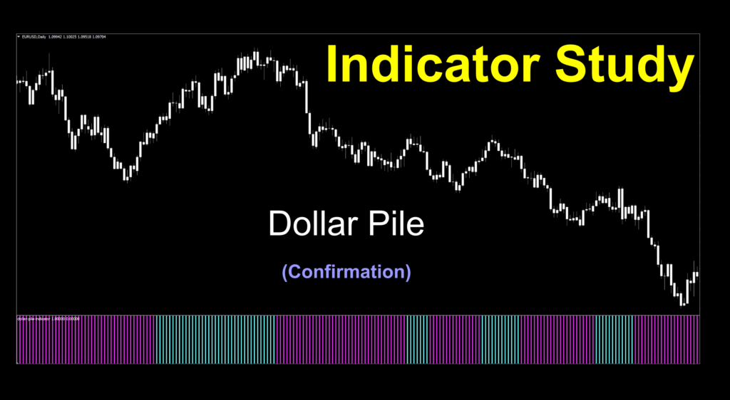 Compare and Contrast
This week, we’re going to try something different. We’re going to compare and contrast two similar type of indicators. We have not done this before, except when we profiled indicators that presented in different styles; i.e., the indicator can be displayed as a line, a candle color, or a histogram but still gave the same signals. That would be the closest we came to what we’re trying this week.
Long Ago…Not Really
A few weeks ago, we profiled a histogram indicator called the Precision Trend Histogram, which, we’ll use to compare the indicator for this week. If you’d like to read about that indicator, you can click HERE. It also contains the embedded technical analysis video.
Video Killed The Radio Star
Well, at least that’s what they said when MTV started. Thankfully, we’re past that. No hard feelings, right? Okay then, we grabbed our data stream of both indicators the night before we posted the blog for freshness. Remember, we record on the 1-minute chart for about eight (8) hours to give us some educational moments. Once you’ve settled back and watched the video, come right back to read the rest of the story to see how things worked out for our new friend.
Who Ya Gonna Call
Email works, right? We’ll never place you on hold if you send us something. We promise that we look at every email we get right away. Sometimes we respond immediately, and sometimes it takes us a little longer – but we always do our best to acknowledge your input. If we’ve neglected to do so, please feel free to send us a “nudge”…kind of like a friendly tap on the shoulder. That being said, send your ideas, suggestions, stories, indicator questions, and whatever else may be on your mind (with respect to Forex please…we can’t compete with Ann Landers) to stonehillindicator@gmail.com.
Thanks For The Compliment
Alright, let’s get back to it. This week, we’re going to look at another histogram to demonstrate why we want indicators that have different math. Some are faster and some are slower with regard to signals, and the objective of a good algorithm is to have one complement the other.
Introductions
Before we get into the comparison discussion, let’s introduce the new indicator. This week, we’re going to look at a histogram, called the Dollar Pile indicator, which was coded in 2019 by an anonymous coder. So thank you, dear coder. Unfortunately, there wasn’t any history or insight to the math…but no matter, let’s press on.
So Much Brightness
For our purposes, we’ll brighten up the lines for better visuals and thicken up the lines as well by changing the standard red/green to aqua/magenta. We’ll put this indicator on first, so you see what it looks like before adding the Precision Trend Histogram for comparative purposes. As this indicator lives below price, candles will be changed to white on white, so you focus on the good stuff…the indicator.
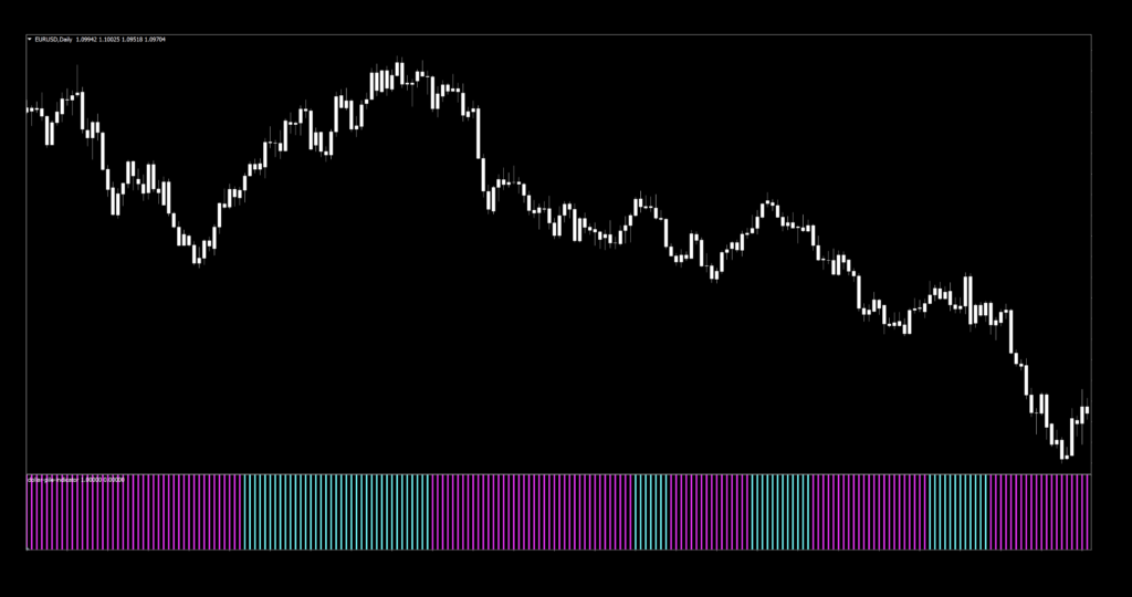
Before we explore the signals, let’s look at the settings.
Settings
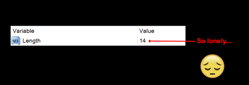
There is just one lonely setting – unlike the many adjustments in the Precision Trend Histogram indicator. So, we’ll roll with that.
Length: The number of periods used to calculate the histogram. The default value is 14, which happens to be the ATR default value. Coincidence? We think not.
Advantages
* Only one setting for quick testing.
* Visually easy to use.
* Quicker reaction than other histogram indicators on default settings.
How We Use It
Long signal: When the histogram turns from magenta (red) to aqua (green). Entry is on the open of the next period.
Short signal: When the histogram turns from aqua (green) to magenta (red). Entry is on the open of the next period.
Alerts and notifications
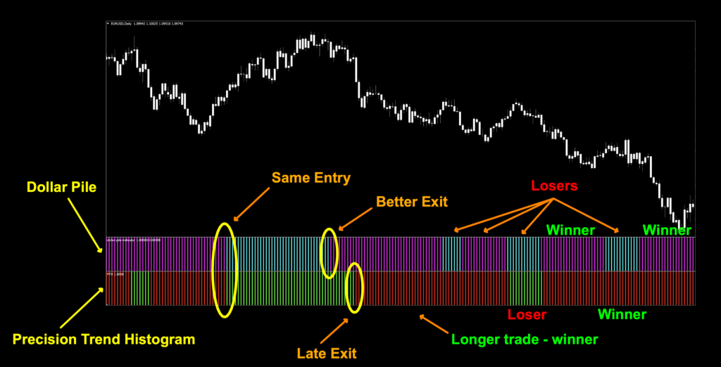
Now comes the fun part. We’ll “stack” the two indicators; the top histogram (aqua/magenta) being this week’s Dollar Pile indicator and the bottom histogram being the Precision Trend Histogram (green/red). Let’s see what we can see.
Break It On Down
From the default view, we can see there are a few interesting things going on. Starting with the “Same Entry”, both indicators called the trend at the same place. Totally cool when one validates the other. Then it gets interesting. The Dollar Pile indicator signaled an exit (or short) before the Precision Trend Histogram. After that, we can see there are better entries/exits depending on which indicator you want to use for what. These are the “bones” of your algorithm. Finding indicators that will reinforce (and play well) with each other and also perform differently; i.e. faster and more accurate exits. So much fun.
Tests Today, Come Prepared
If you’re new to these studies, we recommend looking at some of the older blogs to understand how we conduct our testing.
The six pairs we recommend testing are…
EUR/USD
AUD/NZD
EUR/GBP
AUD/CAD
CHF/JPY
CAD/SGD
The markets we test our indicators are the:
EUR/USD (Euro/US Dollar)
BTC/USD (Bitcoin/US Dollar)
XAU/USD (Gold/US Dollar)
SPX500 (S&P500 Index)
Timeframes and Results
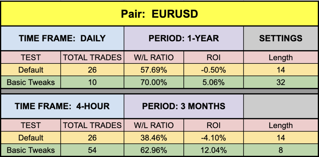
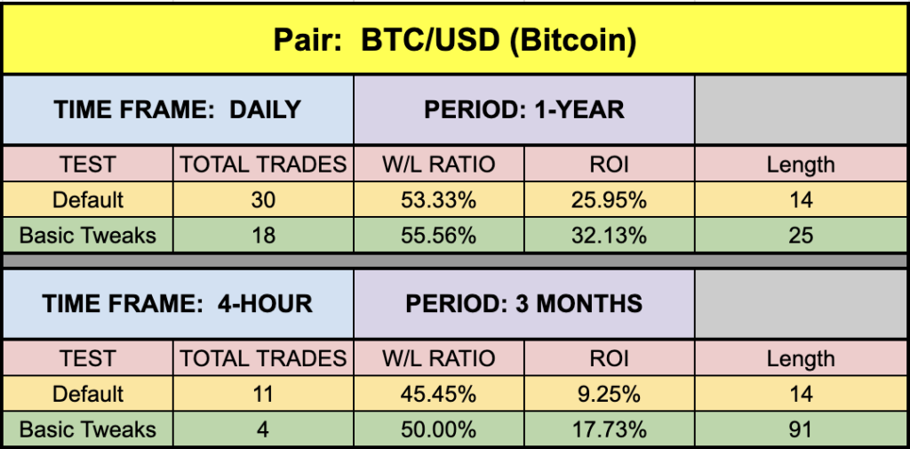
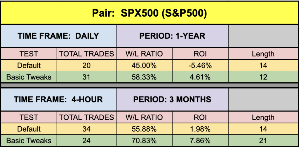
We’ll run the Dollar Pile indicator on the EUR/USD, BTC/USD, XAU/USD, and the SPX500 using the default and tweaked settings across the daily and 4-hour timeframes on the MT4 strategy tester.
We focus on three metrics;
Total trades
Win/Loss ratio
ROI (return on investment)
Results Make The World Go Around
Below, you’ll find the testing results.

Come On Down
Just so you’re aware, we only tested the Dollar Pile indicator, as we’ve already run the Precision Trend Histogram through its paces in that blog. BTC was the clear winner here, although there were some definite possibilities in the other markets we tested. Is it worth your time to try these out? Absolutely, after all, we spend the time testing them for your benefit. Obviously we’re not posting the most optimized values because that would be a pointless…the market changes over time and the values won’t provide the same results. Remember, what we do is demonstrate that the indicators we find can be made better (most of the time) – saving you resources better spent on trading.
Money Management
Money management is based on the NNFX risk profile. That information can be learned in the Advanced Course.
Resources
We’ve made the Dollar Pile indicator available for download on our site from the indicator library. When you’re ready to get it, click HERE.
We’re Here For You
Please ensure you sign up on our contacts page for the latest digests. We just put one out a couple of days ago for July 2023. If you missed it, email dan@stonehillforex.com with the title “Latest Digest Please” and we’ll send it off to you withing 24 hours. And you’ll want to subscribe to our YouTube channel for the technical analysis videos. Don’t forget, we’re also on Facebook and Quora, where we answer questions relating to Forex.
Our only goal is to make you a better trader.
BTW – Any information communicated by Stonehill Forex Limited is solely for educational purposes. The information contained within the courses and on the website neither constitutes investment advice nor a general recommendation on investments. It is not intended to be and should not be interpreted as investment advice or a general recommendation on investment. Any person who places trades, orders or makes other types of trades and investments etc. is responsible for their own investment decisions and does so at their own risk. It is recommended that any person taking investment decisions consults with an independent financial advisor. Stonehill Forex Limited training courses and blogs are for educational purposes only, not a financial advisory service, and does not give financial advice or make general recommendations on investment.

