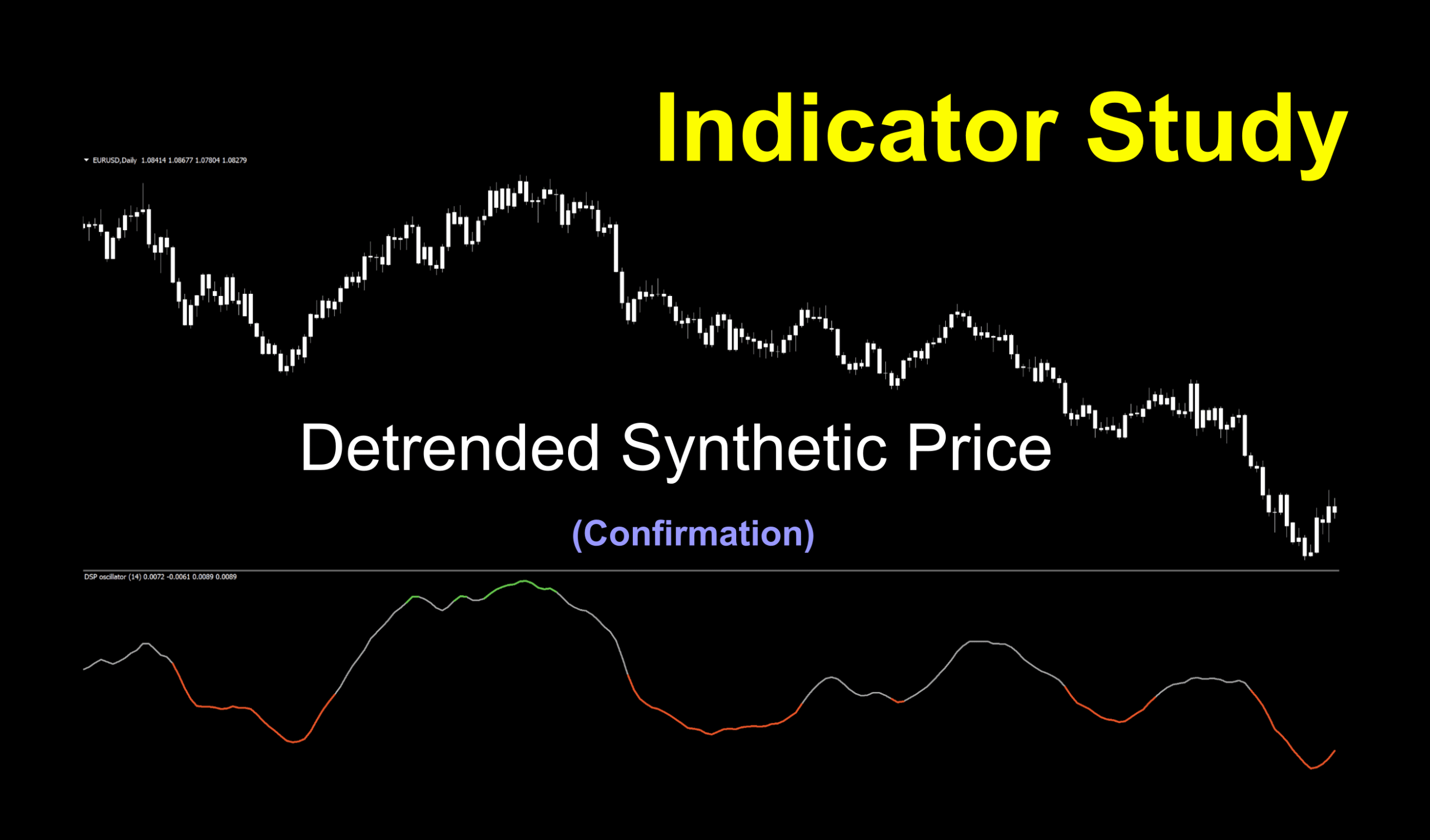
A Little Something to Look At
This week, we’re investigating an indicator called the Detrended Synthetic Price indicator, developed by a guy we know and love. Aesthetically speaking, it’s got an awesome name. We’ll have to see if it provides us with awesome signals. We’ve been using MT4 since its inception back in 2005 and for the most part, the included indicators really haven’t changed much. That being said, we’re bringing you things you won’t find there. Let’s take a peek at what the DSP can do for us.
Who’s That Guy?
This indicator was developed by none other than our hero John Ehlers and was showcased in the July 2000 edition of Stocks & Commodities magazine. Over the years, people have found different ways of using it to accommodate different securities, but we think we’ve got a pretty simple interpretation for ease of operation.
Class is in Session
The origins of the DSP concept were not specifically designed with trading in mind. Originally, it was used in the prediction of various occurrences in nature, including planetary movements and tuned for the field of electrical engineering.
Off To The Market
By the time it made its way into our arena, analysts were using it to predict changes in market conditions and price action, especially those revolving around commodities with seasonal cycles. Mr. Ehlers takes a deep dive into these concepts in his book “MESA and Trading Market Cycles”.
Cycling Math
The broad strokes of the math to calculate the DPS indicator include highlighting the dominant cycle of market price by subtracting a half-cycle EMA (Exponential Moving Average) from a quarter cycle EMA.
Confirmation Indicator
Used as a color change, this confirmation indicator lives below your chart as an oscillator. It can be used as your primary confirmation signal or as a secondary filter in your algorithm. It might even make a good exit indicator as well. We’ll talk about that a little later. The signals are very clear and easy to use.
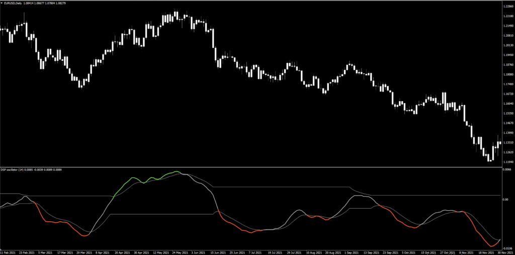
Shine On You Crazy Diamond
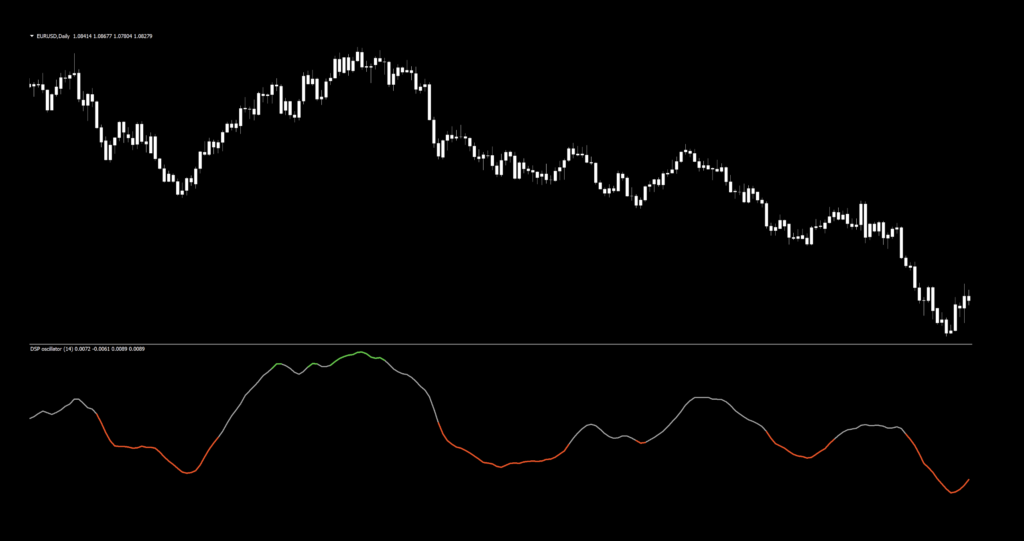
In the screenshot below, we’ve thickened the colored lines to make them easier to see. And, we’ve changed the candle colors to white to remove price action bias, allowing us to focus strictly on the indicator.
Before This, That
Before we get into the settings, we want to clarify a few things that you’ll see in the settings. First off, you’ll notice there are two sets of gray lines on the chart. The first being part of the green/red curve and the second similar to a Bollinger Band. The former just indicators “no signal”, and the latter, just ignore. In fact, the “signal period” setting adjusts those bands, so you can ignore that as well. Furthermore, you can just get rid of them (as we did) to clean up the chart.
Not Zero
Next, you can see a “0.00” on the right side. There is a setting to switch between color change based on the math or color change based on the zero cross. We chose to run our tests based on the math, not the zero cross. But as VP states in his videos, and we most definitely echo the sentiment – testing is an activity you MUST engage in as a willing participant.
Rocky Mountain Amplitude
Another feature you immediately notice (and part of the nature of oscillating indicators) is that the lines not only turn colors, they rise and fall. This is the “amplitude”. Amplitude in this instance describes how much momentum price has by how steep the climb or fall of the curve. Great stuff, but we don’t care. Just concentrate on the colors.
All that being said, this is what it should look like.
Settings
This indicator has four variables in the settings window, and we’ll use only the first two for our testing purposes. Below is the settings screen.
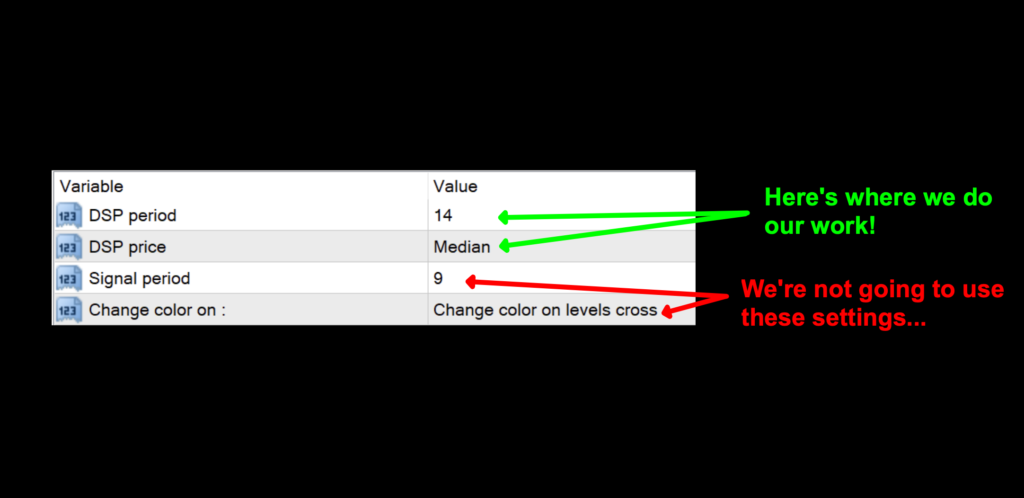
DSP period: The number of periods used for cycle consideration. The default value is 14.
DSP price: This is the data set the indicator uses to generate the red/green/gray signal line. The default value is Median.
Advantages
* Color change indicators are one of the easiest types to use.
* Only two settings to adjust.
* May be used as an exit indicator depending on the rest of your algorithm.
How we use it
Long signal – When the signal line turns green, entry is made on the open of the next period.
Short signal – When the signal line turns red, an entry is made on the open of the next period.
Let’s take a look at a marked up default chart to see where the entries would be.
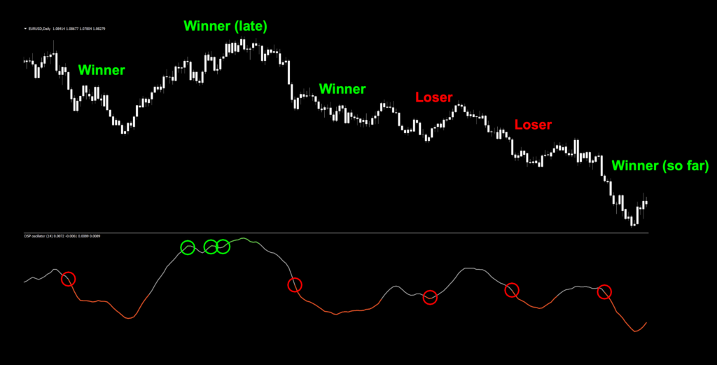
Better Than The Rest?
The default settings aren’t great, as you can see. In fact, some of the entries are a bit late. Overall, it’s actually not too bad right out of the box, but guess what? You can make it better.
Exit to the Highway
A quick look at the chart demonstrates that using this as an exit is a possibility when the color turns gray (not green). If you have a different indicator in place as an exit indicator then, just use it as an entry. No big deal.
Testing…Testing…Testing…
Remember, comprehensive analysis is strongly suggested, and we advocate backwards and forward testing indicators or systems prior to trading actual funds. We propose conducting your tests on the following pairs.
EUR/USD
AUD/NZD
EUR/GBP
AUD/CAD
CHF/JPY
CAD/SGD
If it doesn’t work on these 6 pairs, chances are it won’t work on other pairs. This is not an absolute, but we’ve found this rule is reliable in most cases.
The markets we test our indicators are the:
EUR/USD (Euro/US Dollar)
BTC/USD (Bitcoin/US Dollar)
XAU/USD (Gold/US Dollar)
SPX500 (S&P500 Index)
Timeframes and Results
In our initial test, we’ll run the Detrended Synthetic Price indicator on the EUR/USD, BTC/USD, XAU/USD, and the SPX500 using the default settings across the daily and 4-hour timeframes on the MT4 strategy tester. We use the fast method of testing the indicator to get a general idea; however, you may also run the tick-by-tick data set for a more precise result (which takes considerably more time).
As No Nonsense Traders – and therefore Swing Traders, we will not examine shorter time frames in these studies. We will also run an additional test, using different values for the settings, to analyze which one may work better and examine the following results:
Total trades
Win/Loss ratio
ROI (return on investment)
There are other metrics included in the strategy tester report, which can be compared, but these three metrics provide the necessary gauge to make quick decisions as to the usefulness of a particular indicator and its settings.
Next, for comparison, we’ll explore the following;
Daily – 1 year
4-hour – 3 months
The reason exceptionally long (or short) testing periods are not included is due to changing market conditions, which might return irrelevant information. A balance of statistically significant data is necessary for accurate results.
And the Outcome…
Below are the spreadsheets illustrating the results from our tests.
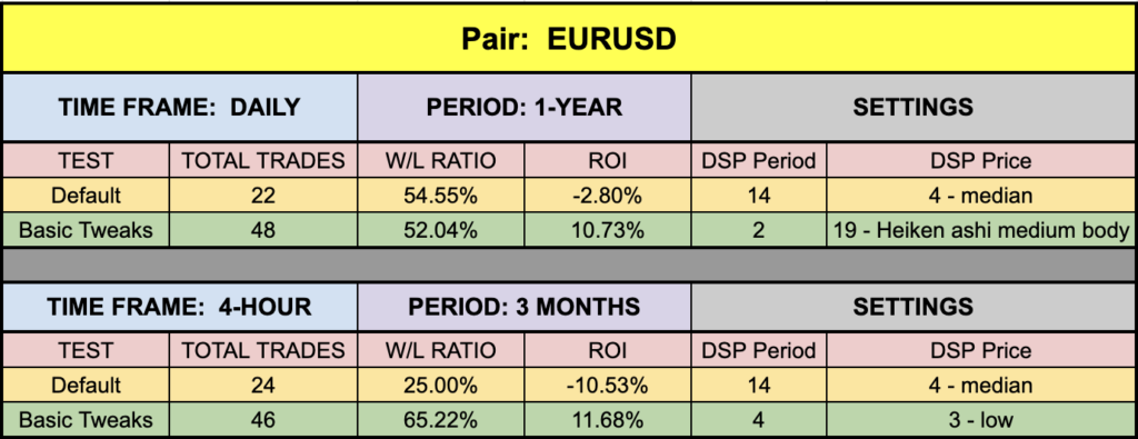
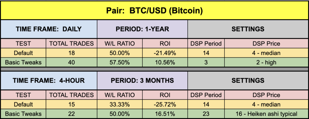
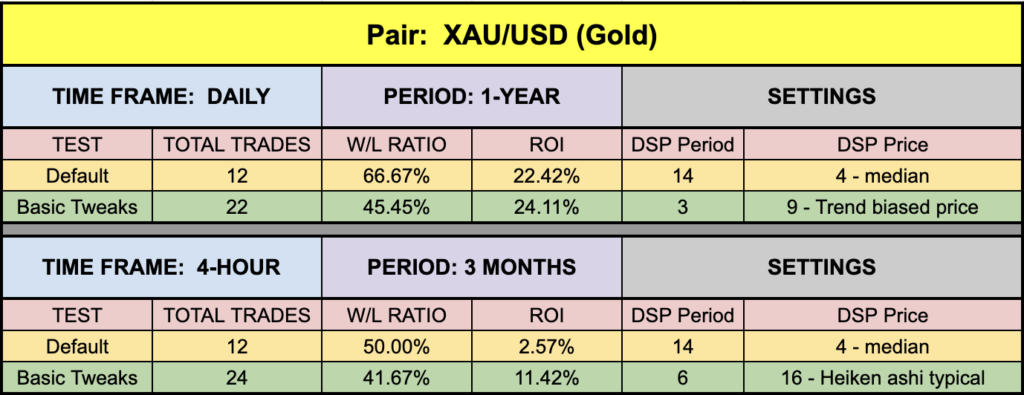
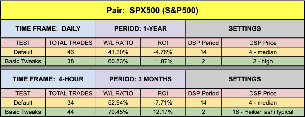
The green highlighted rows represent “basic tweaks” on the settings which returned better results. Are these the best? Not necessarily. Given that variables including testing date range and broker data are different from person to person, you may find better settings.
Trust In Yourself
Remember, the overall NNFX philosophy of taking profit, risk, and drawdown is that YOU are creating a system which YOU will be trading. Don’t let anybody else take that away from you. Part of the learning process is digging in and doing the work yourself. To learn more about these topics, check out the Advanced Course!
That being said, the results we post in these blogs should never be considered specific trading advice.
***Note: Remember, never use just this one indicator as your decision of whether to open or close a trade. It should be part of a system.
Money Management
If you are curious as to what money management is used on our tests; we have a certain way of determining wins and losses, which can be found in the Advanced Course. Our goal here is to determine how well the indicator reacts to price with respect to producing a long or short signal. Your system, with its risk profile, will dictate individual returns.
Resources
As we did with past indicator studies, we’ve made the Detrended Syntetic Price indicator is available for download on our site from the indicator library. We will keep adding better indicators with each study for your use, at no charge. When you’re ready to get it, click HERE.
More to Come
There’s a lot more to come. We are excited to provide more trading tips in the near future. Sign up on our contacts page or subscribe to our YouTube channel. Receive early notifications as we continue to publish helpful, relevant, and informative Forex related material to support your quest to become a better trader.
And, now you are aware of another indicator that many traders don’t know or use.
Our only goal is to make you a better trader.
BTW – Any information communicated by Stonehill Forex Limited is solely for educational purposes. The information contained within the courses and on the website neither constitutes investment advice nor a general recommendation on investments. It is not intended to be and should not be interpreted as investment advice or a general recommendation on investment. Any person who places trades, orders or makes other types of trades and investments etc. is responsible for their own investment decisions and does so at their own risk. It is recommended that any person taking investment decisions consults with an independent financial advisor. Stonehill Forex Limited training courses and blogs are for educational purposes only, not a financial advisory service, and does not give financial advice or make general recommendations on investment.