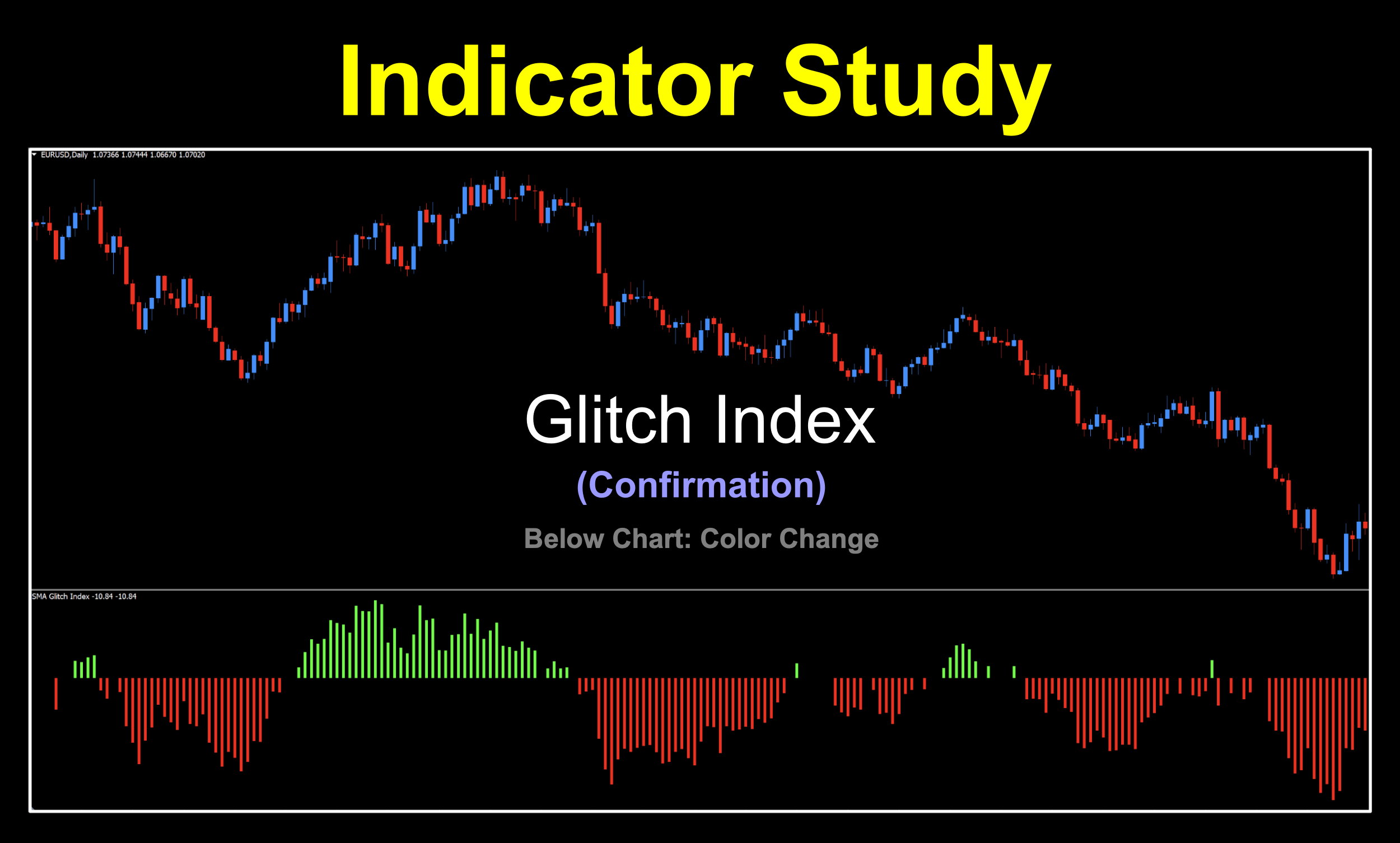
Glitch Index

***UPDATE***
After some investigative research based on a couple of community contributions (Thanks Eric & John — you guys rock!), we discovered that the Glitch Index indicator performed “strangely” with non-4X pairs (BTC, XAU, SPX500, etc.). After digging into the code, Niels noted a couple lines of code which were creating issues with the way the indicator plotted based on securities that had values far exceeding the 0 to 1 range (i.e., think of the EURUSD @ 1.08160 versus BTCUSD @ 57,823.43). This may have been due to the fact that this indicator is over 10 years old, when most Forex traders were trading exclusively Forex pairs. The issues in the code have been corrected, and the corrected script has been uploaded to the library (called “Glitch Index Fixed”). If you have the original version from when the blog was initially posted, please delete that one and replace it with the new one. The information in the blog has been tweaked to reflect a couple of minor changes; however, the information in VP’s profile and the technical analysis videos are still valid.
Glitch in the Matrix
Say it ten times fast. Glitch, glitch, glitch…did you do it? It’s weird how a word can sound like absolute nonsense after repeating it multiple times. If, you can get through it with fidelity. Anyway, we’ve got an indicator with a pretty cool feature even if it’s got a peculiar name, which we’ll get into shortly.
Passed Along
We found this bad boy coded for MT4 in 2024, but as we researched further, discovered it was actually an .lua indicator from 2013 and taken from an even older source code from MetaStock.  Suffice to say, it falls within our “post-1996” date, but the original development dreamed up by a fellow trader, or perhaps just a programmer, is a bit of a mystery. All good, though!
Uncomplicated and Easy
This below chart color change histogram style indicator is trend based with a nod towards both trend strength and overbought/oversold notions, but we don’t necessarily use them in this fashion. No sir, our interpretation of the signals is much easier. And after all, who doesn’t like easier.
View From Afar
We’ll first take a gander at the default view because there are a few changes we need to make before we begin the analysis portion. It’s not a big deal, so just roll with us.
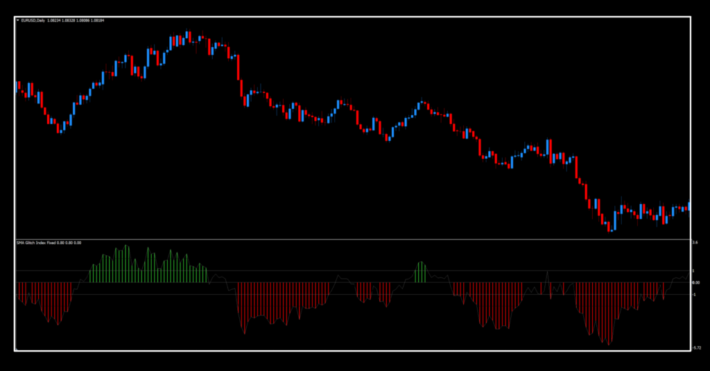
Now, We’ll be taking a closer look at the components of this indicator to identify what we need and what we’re going to remove.
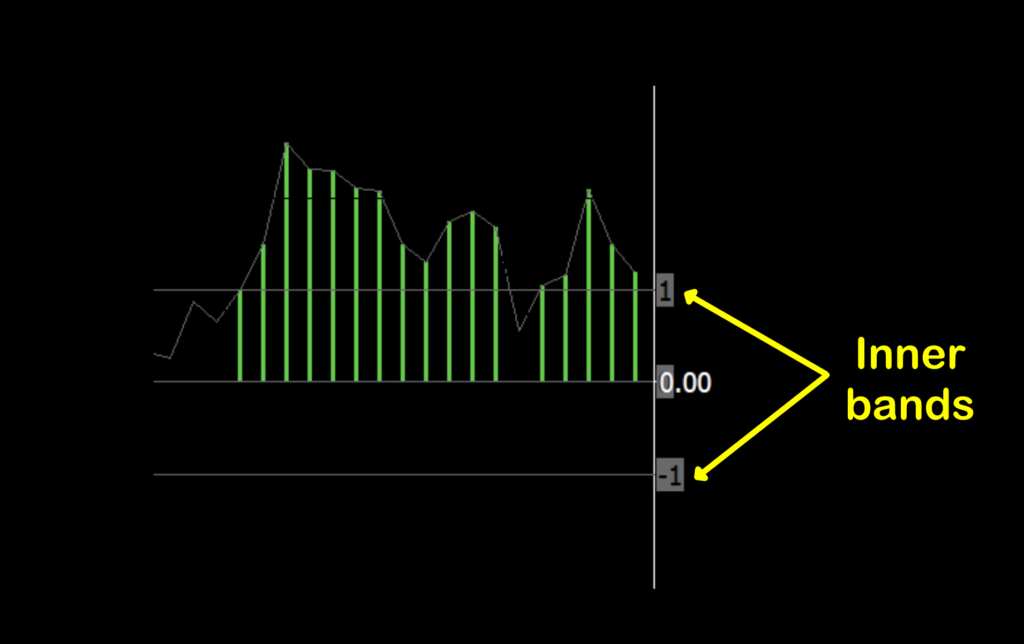
The first thing we’ll address are the “Inner bands”. They serve as a filter whereby if the histogram bar data does not meet a specific minimum value, no candle is printed (circled in magenta), meaning that a proper trend has not developed. The Inner bands value is adjustable in the settings menu. We will be using these.
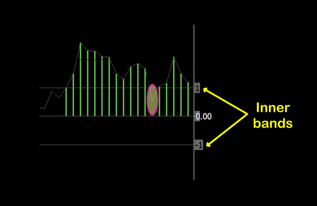
There is an “Outer bands” setting, but we aren’t using them, so whatever you set your inner band to, change the outer band to the same number.
And of course, centered is the zero line. However, this indicator is not a zero line cross because we will be taking into consideration areas where no candle is printed.
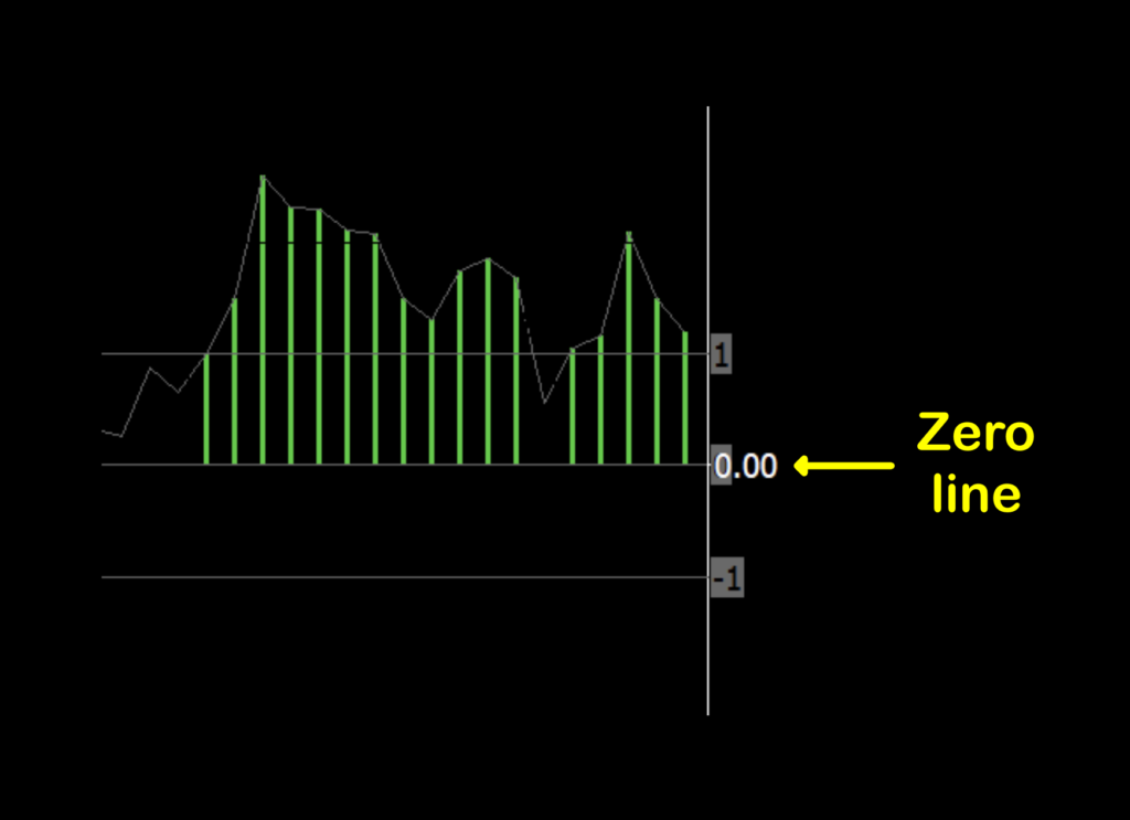
We’re going to be simplifying this all the way down to a color change; green for long, red for short. By removing any additional lines and colors, it helps to keep your chart free of unnecessary distractions.
Magnitude and Dimension
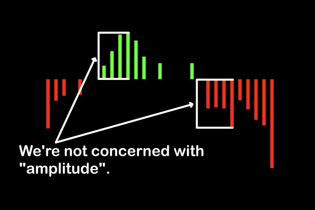
One remaining note we need to mention is the amplitude, or height, of each bar. Bottom line, it’s irrelevant…meaning that the perceived strength of the bar is not one we’re concerned with, only the color.
Settings & Environment
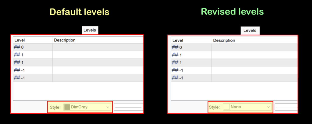
Before we get into the input settings, let’s get our charts squared away with regard to what we see. The first thing is to change the colors. We’ve created a side-by-side image of what the default colors are and one with the new and improved colors.

Now, we’ll take a quick peek at the settings menu to explain the changes to the outer levels. We’ll get to the indicator settings shortly.

If you make changes to the band levels in the input menu, it will automatically change in the level menu, so you won’t have to deal with them as noted below. The only thing you’ll need to do is change the color of the bands from “DimGray” to “None”.
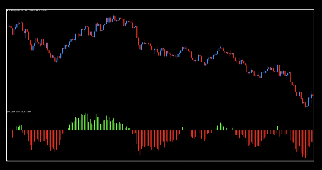
Now, the indicator should look like this…
Settings
Alrighty, now we can check out the settings menu through the signal lens. There are only four, and provide considerable latitude with respect to changes.

Glitch ma period: The overall number of periods for the Glitch Index calculation. The default value is 30.
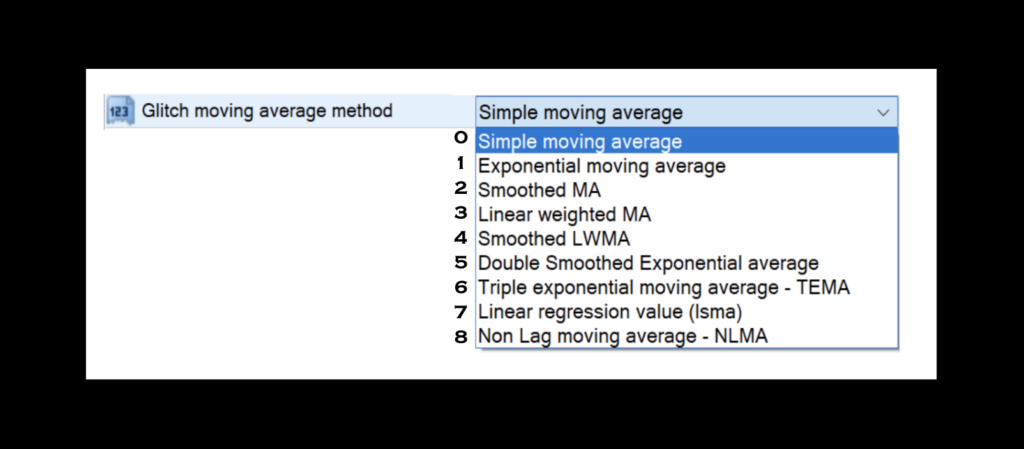
Glitch moving average method: The type of moving average used in the Glitch Index calculations. The default value is the Simple Moving Average (SMA); however, you have eight choices.
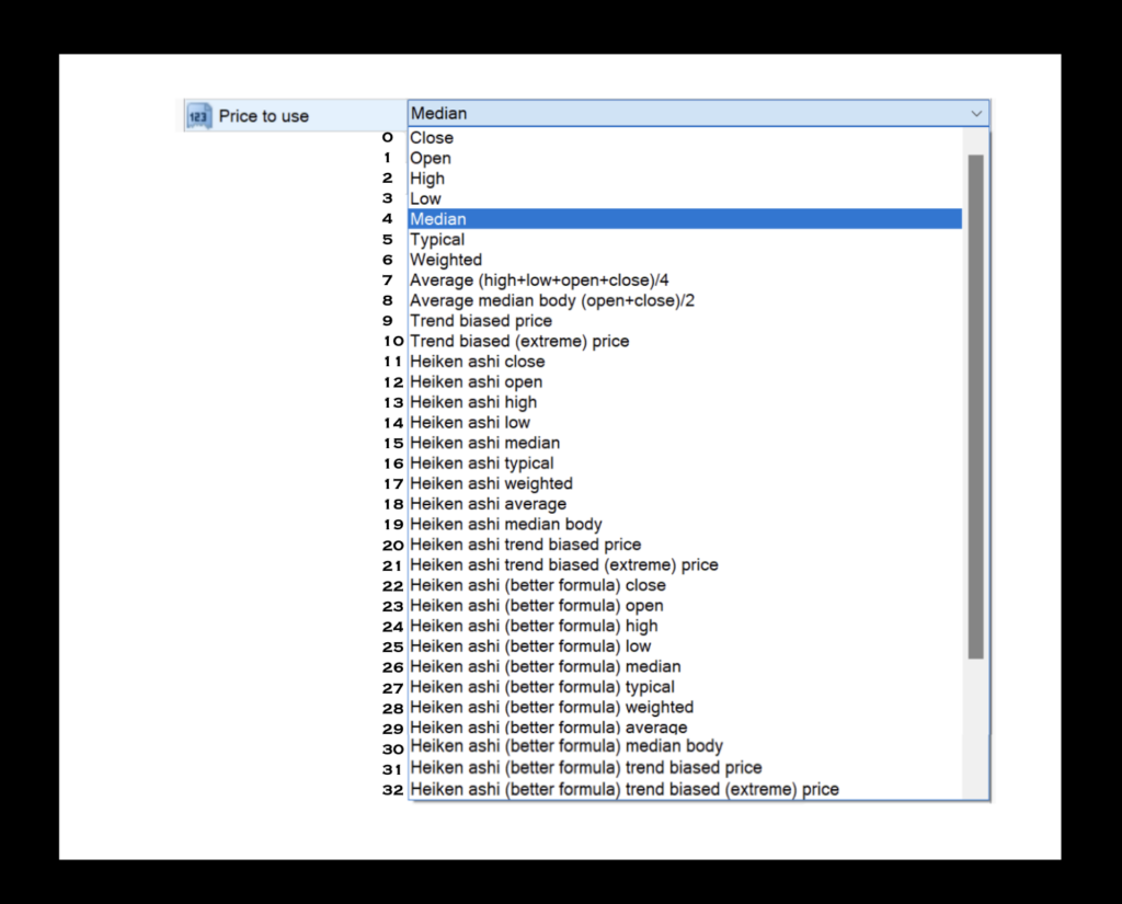
Price to use: The specific price data set for the Glitch Index calculations. The default value is 4 — Median. You have 32 choices.
Glitch inner level: The “filter” used to determine when an existing trend has been identified. The default value is 1.0.
Glitch outer level: This value should have been changed to 1.0 and left alone after that. We did not use this setting for any testing metrics.
Contact
With our chart properly set up, we’ll take a deeper look at the signal. Remember, we’re treating this strictly as a color change, not as a zero cross or anything else.
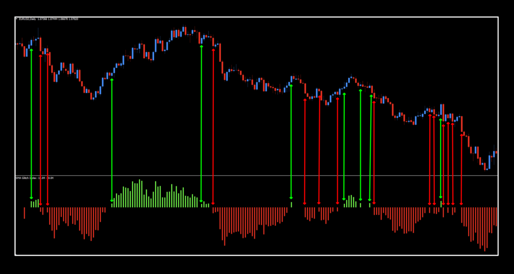
The first thing that we picked up on are the multiple signals in a couple of areas. Does that mean each one is an entry (or exit)? Unlikely. Recall that you’re not trading this indicator alone in a vacuum, so having a slower C2 in addition to your baseline would have prevented many of those signals from even popping up on your radar. You’d already have been in a trade, or have received an exit signal elsewhere.
Poaching Pips


Solid
We did okay with this one. The EURUSD posted some nice figures. The SPX500 returned results pretty much on par with what we’ve been seeing. BTC and XAU were the darlings of the bunch with their delightful returns, and these aren’t even the best ones for the time span we tested through. Go have some fun with this one. Once you get it configured, consider saving it as a chart template to speed up your testing.
Resources
You can download it from the on-library for free. When you’re ready to get it, click HERE.. Also, be sure to subscribe to the Stonehill Forex YouTube channel for the technical analysis videos. Sign up for the Advanced NNFX Course HERE.
Our only goal is to make you a better trader.
*Our published testing results are based on money management strategies employed by the NNFX system and depend on varying external factors, which may be different between individuals and their specific broker conditions. No guarantee, trading recommendations, or other market suggestions are implied. Your results and subsequent trading activities are solely your own responsibility.
BTW — Any information communicated by Stonehill Forex Limited is solely for educational purposes. The information contained within the courses and on the website neither constitutes investment advice nor a general recommendation on investments. It is not intended to be and should not be interpreted as investment advice or a general recommendation on investment. Any person who places trades, orders or makes other types of trades and investments etc. is responsible for their own investment decisions and does so at their own risk. It is recommended that any person taking investment decisions consults with an independent financial advisor. Stonehill Forex Limited training courses and blogs are for educational purposes only, not a financial advisory service, and does not give financial advice or make general recommendations on investment.

